1. Creating User Personas
Started my role with going over existing user research and segmenting our users into different personas. This allowed me and my team and to better define our users’ needs when conceptualizing new features and accelerate ideation processes. Each persona document included their motivation, key pain points, key needs, how many users we have that match this persona, and the level of engagement they have with the system. I also included relevant touch points as the system includes a vast range of services, where certain personas might not use, or even have access to. This gave a clear indication of how our users actually use the system, and what modifications we can make to personalize the user experience.
2. UI Improvements
I took a “data-first” approach in my redesign, in order to allow users to focus on the page’s content as they work, instead of being distracted by the UI. This was accomplished by reducing real-estate taken by the top user messaging area and the toolbar, where I used color contrast to have it be less prominent when not in use. I also redesigned UI components used to display the content of selected pages, to improve understandability.
Before
After
3. Team Library to Facilitate Figma Usage for PMs
Starting out, the product team was using Axure to create low-definition designs. As part of my role I was asked to create a repository for all design patterns, that the product team will be able to use with ease. I created a team library in Figma, which contained all of the design patterns in our design system in the form of components. I created a Figma account for each PM and held a couple of training sessions which were successful in allowing the product team to independently take on small design tasks for small features and modifications that they needed to communicate visually to the dev team.
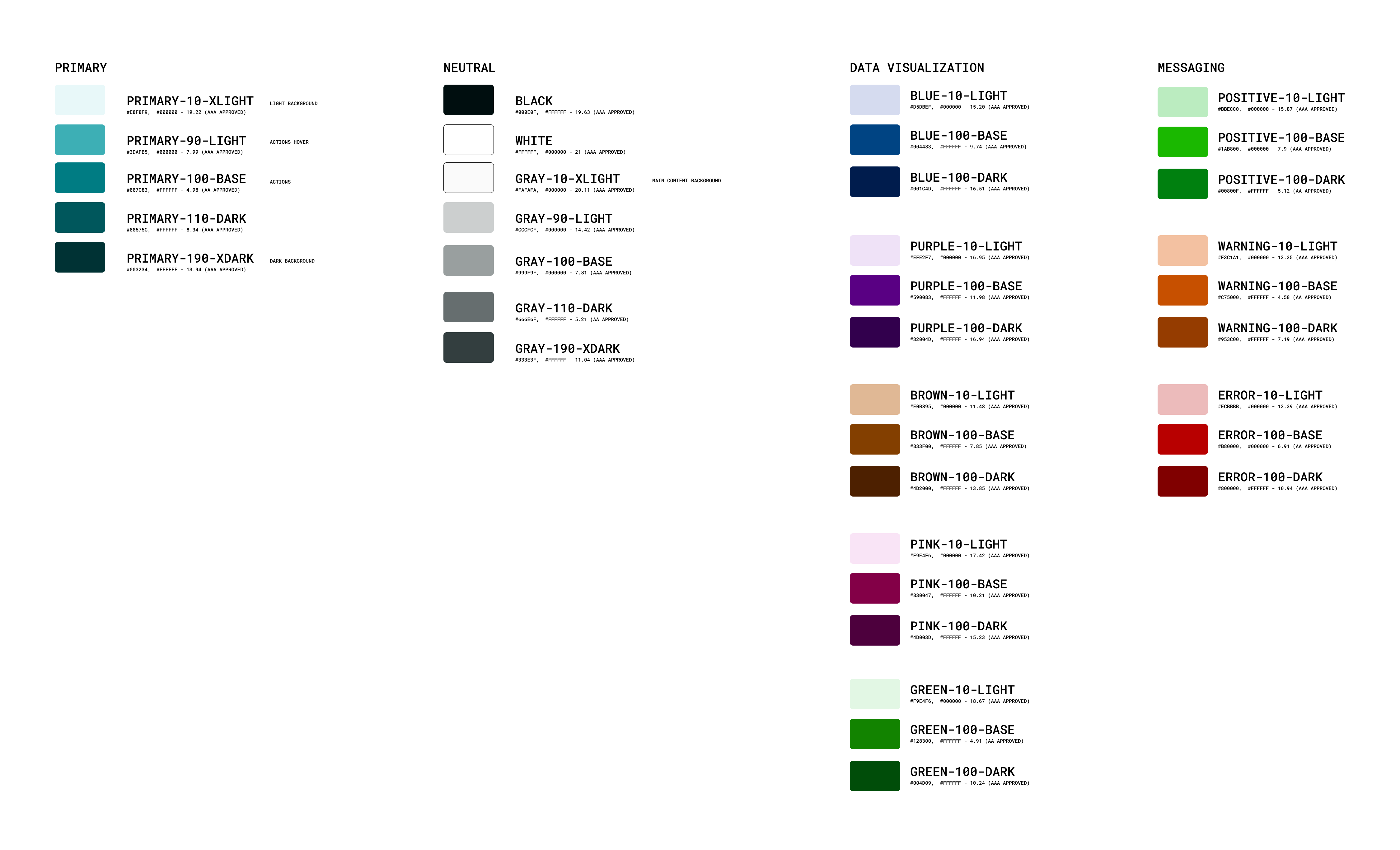
4. A Cohesive and Accessible Design System
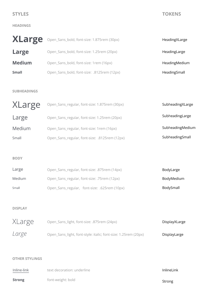
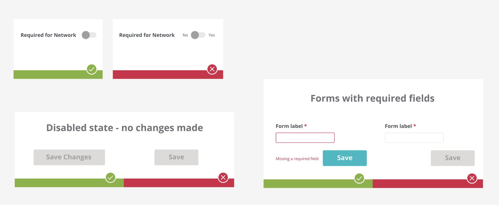
The existing design system had accessibility issues and consistent of many similar colors, and a variety of font sizes and weights, without any proper designation. I created an accessible color palette - each color was tested for its accessibility score against the background it would be displayed on. The primary color needed several shades to compliment light and dark themes, and data visualization and messaging colors needed a replacement for orange / yellow which would have a high accessibility score while maintaining their psychological value. Fonts sizes and weights were reduced in quantity, defined by their usage within the system, and assigned tokens to be used when communicating the to the dev team. Standards for design “DOs and DON’Ts” were given illustrated instructions, which were documented in a cross-department confluence page.
5. A Production Timeline Modules
The Challenge
Creating a timeline module that would replace excel sheets, and show all the information needed by the production team whilst improving on the editing experience offered by Excel. Timeline slots needed to contain information about production tasks including the task’s type and possible milestones related to it. In addition, production tasks had to be assigned to specific episodes (which did not allow for a standard Gantt chart design), and the tasks needed to have representation when working on staff assignments.
Design Process
I started the design process working closely with the product manager in charge of the project to fully understand the client’s needs. I got references from the production team’s existing Excel sheets as well as inspiration from different online timeline products such as Monday’s Gantt chart timeline, and also from other types of digital products, such as Google Photos web app, which inspired my solution for the bulk selection of timeline slots.
Solutions
- As a click on a timeline populated slot was designed to place another task or open an edit dropdown (depended on the selected tool). I also added a checkbox to appear on hover for each slot, which allowed users to select multiple slots for bulk actions
- Stretching a slot to increase its task duration was achieved by dragging it on either end. This utilization of different mouse events was made clear to the user by adding handles to the sides of the slot on hover.
- A staff view would collapse the timeline, giving an indication to the duration of each task, while still having the ability to show the episodes assignment via tooltip. This allowed to have a dedicated, convenient UI for assigning staff within the timeline.
Timeline Staff View
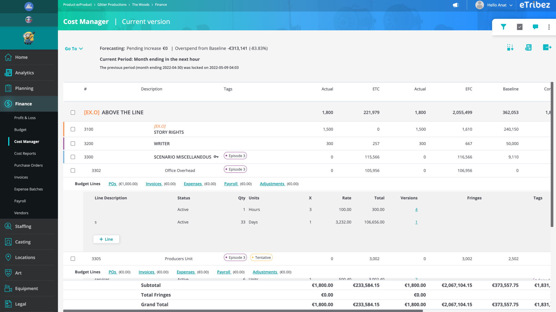
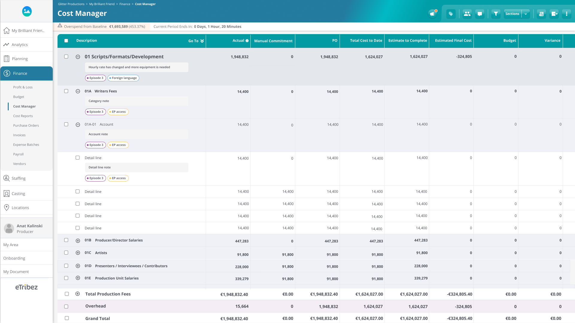
6. Cost Management
The Challenge
Improving the experience of this data-heavy module, and allowing room for more functionality in an already highly-saturated page. A lot of work was done on this module and its counterpart - the budget module. I will focus of 2 major challenges
- The cost manager table had a 4-level hierarchy of rows, where the differentiation between levels was expressed with real-estate consuming indentation.
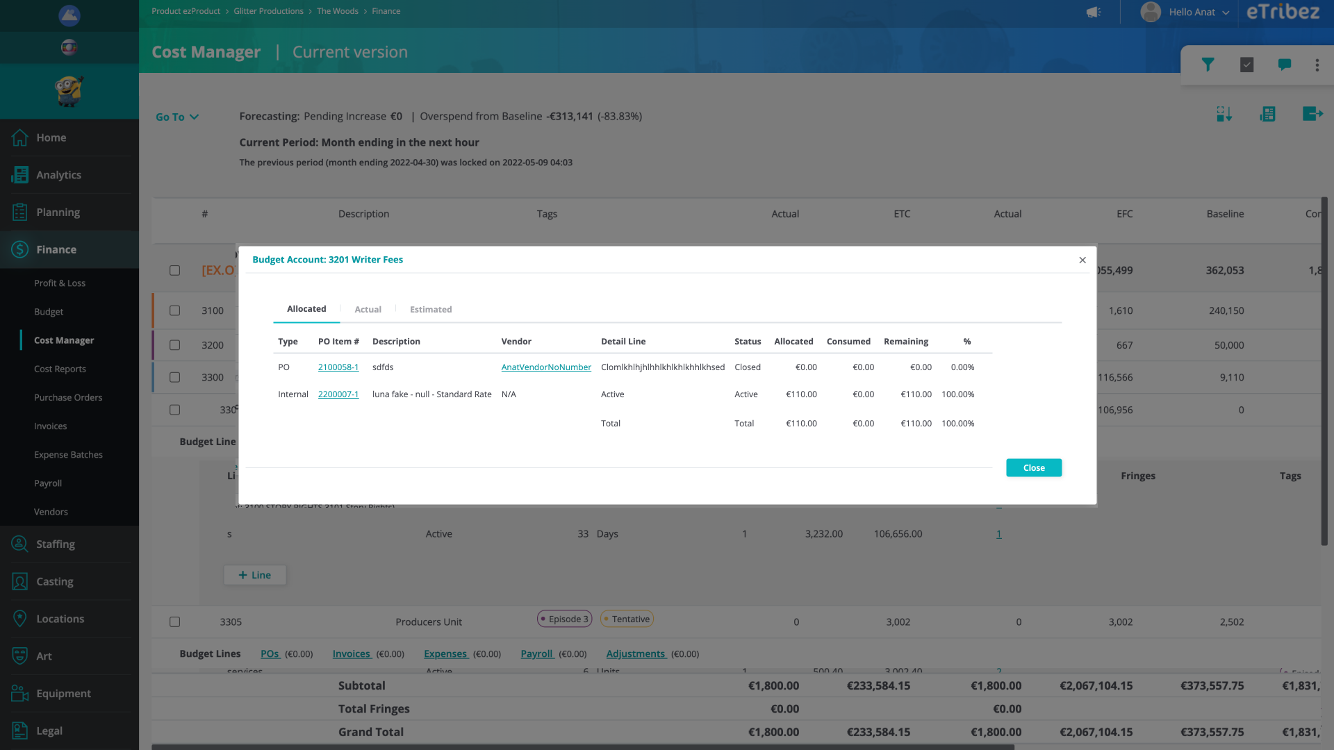
- The bottom level row contained different types of data (information about invoices, POs etc.) that opened in a modal, which made it impossible to edit this data while reviewing the table-data simultaneously. The links to open the modal also created a problem, as they appeared within the row, and messed up the data presentation.
Old Design
The Design process
The design process on this module included short-term modifications and enhancements required by the client, and expressed by the PM team. All the while, working on long-term projects of improving the overall page experience, on which I worked closely with our CPO, to ensure any big change would match the page current functionality and the desired functionalities we set out for the module to include in the future. Our bigger changes were each tested with our clients. We would hold client meeting where the new changes would be presented to a few people from our clients’ staff, to see if they understand the changes and if those matches their needs.
Solutions
For the 2 challenges presented above, solutions included the following:
- A row-level differentiation expressed with color, font sizes and weights, to replace the real-estate consuming indentation
- A bottom drawer to present the information previously shown in a modal, allowing user to edit the information while reviewing the table data. Instead of having tabs for allocated, actuals etc. as the previous modal had, I used the table’s headers, as they already represented these types of data (allocated = POs, actuals = invoices etc.). This usability change was done by allowing the user to click on a row cell to see the information relevant to it.
New Design
7. Production Documents - File System Module
The Challenge
Creating a file system module that would solve a couple of primary user pain points:
- In a production, most documents need to go through an approval process which involves several people reviewing the documents, approving them, and transferring them to the next approver. This process can become difficult to monitor, and documents can get “stuck” with a certain staff member. Producers needed a solution that would allow them to keep track of the approval process, and help in making the process move forward automatically.
- A typical production file system would carry hundreds if not thousands of folders and files. In addition, many folders would contain files of the same name, making it even more difficult to find the exact file needed at a given time, and requiring a smart search feature.
Design Process
This module was designed from scratch, taking inspiration from existing products including Google Drive, Dropbox, and Box. Users’ needs were communicated via the PM in charge of the project, and several meetings were held with the main client to go over the offered solutions. For these meetings I was asked to present high-definition designs in the form of Figma prototypes, so to convey the clearest representation of the design to the client.
Solutions
- An easy setup functionality was offered, where a user can select to create a file system from an existing template or project. This option would create a folder structure that fits the production’s needs, allowing the user to skip this phase and move forward to uploading files.
- The folder design included a list of of inner folders and files, with a sidebar to present folder / file information. This sidebar enabled users to quickly view the details of a file / folder, and tracking on their approval status, without having to go into the file / folder. It also allowed bulk editing of the approval process for several items at once.
- Above the folder / file list, status boxes were placed, to give the users an overall indication of the approval process relevant to the current folder
- The search feature allows the users to perform a global search from any folder, and included an elaborated filter system to help the user fine-tune their search


