1. Home Page Personalization
The Challenge
The project aimed at creating a personalized home page for news publishers, that would automatically adjust the content and layout according to the user’s preferences. The main challenge of the product team was understanding the major needs and pain points of every day readers, and realize the impact of the personalized page experience.
User Research
I was asked to perform a longitudinal user study to compare the base version of a publisher’s home page with the Taboola generated personalized home page. The study was conducted on the Chicago Tribune website, using Usertesting.com as the research platform. I used screener questions to find users from the Illinois area who were readers of the Chicago Tribune, and used a split test to get their reactions to both versions of the page. The first step of the study brought up several topics that were summarized for the product team to address, while the research continues. These included: noticeable content redundancy, hierarchy of information based on bold lettering and bigger imagery, and the user’s interest in having control over the personalization algorithm.
2. Taboola Stories
The Challenge
Taboola stories is a feature meant to help publishers generate more engagement with users, by utilizing a technology previously kept within social media, that allows users to be quickly get up to date with current events that are personalized to their specific interests. As stories cannot use actual user data, a UX solution was needed, that would attract more user engagement. Generating more user engagement would also allow more exposure to Taboola placed advertisement which in-turn would increase the value of the Taboola feature to the publishers.
User Research
I performed a usability study, using both Usertesting.com and Usability Hub, to test the visibility of the feature’s entry point, and understand users’ attitudes towards it. First iterations for feature modifications based on the research included:
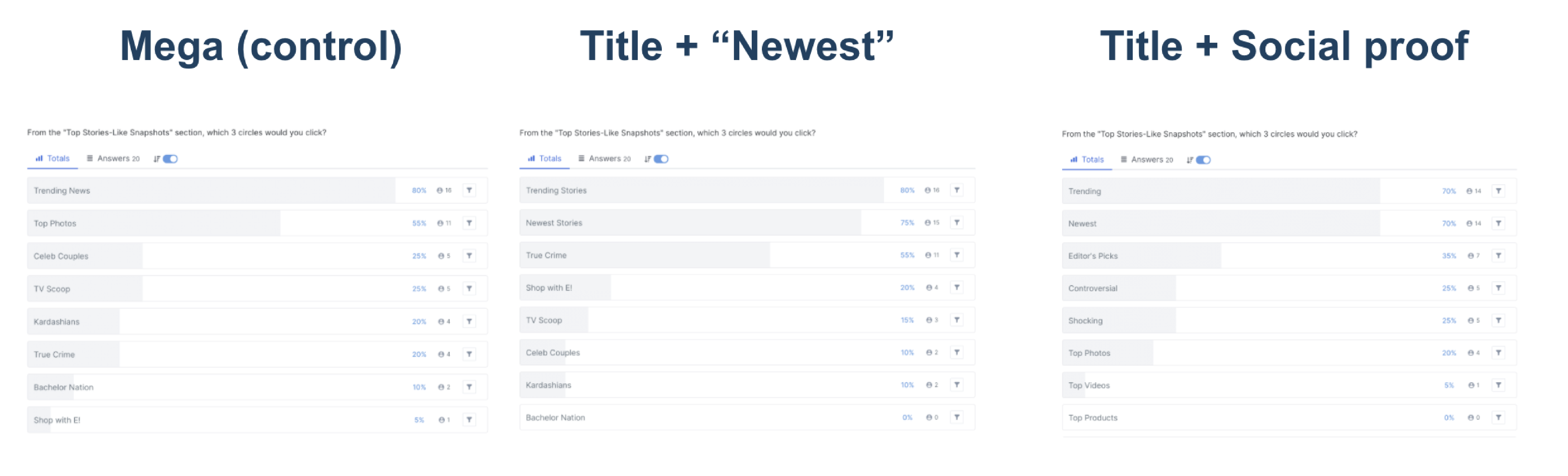
- Adding a category for “Newest stories”, as research showed users stating that their main purpose when visiting the publisher’s website was to catch up on new events. An hypothesis further confirmed by a “first click” test made with Usability Hub, where more users clicked on the “Newest stories” category than any other category aside from “Trending” which received the same number of first clicks.
- Adding a title to the feature that would clarify its purpose and value to the user. The tested titles had copies which would resonate with the user’s goal of getting caught up quickly.
“First click” test findings
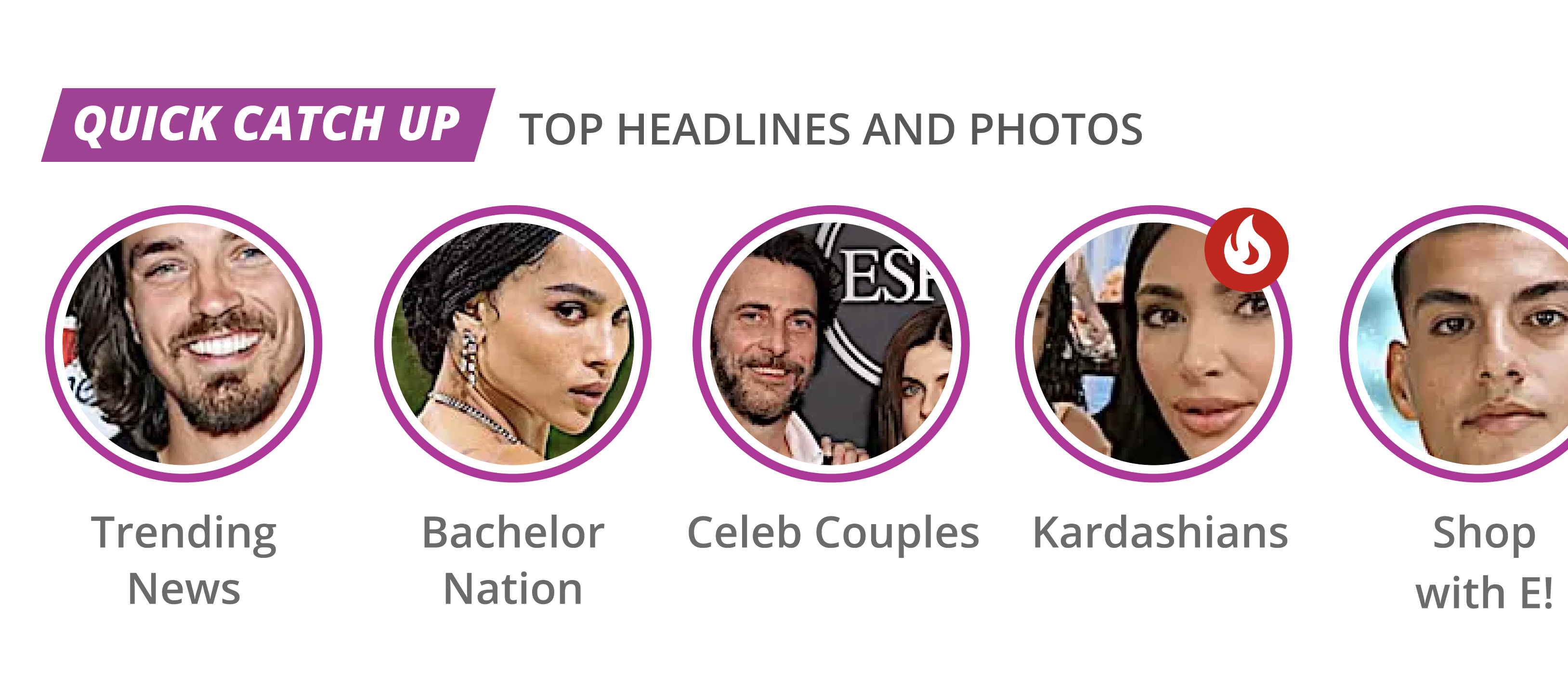
Stories Title V. 1
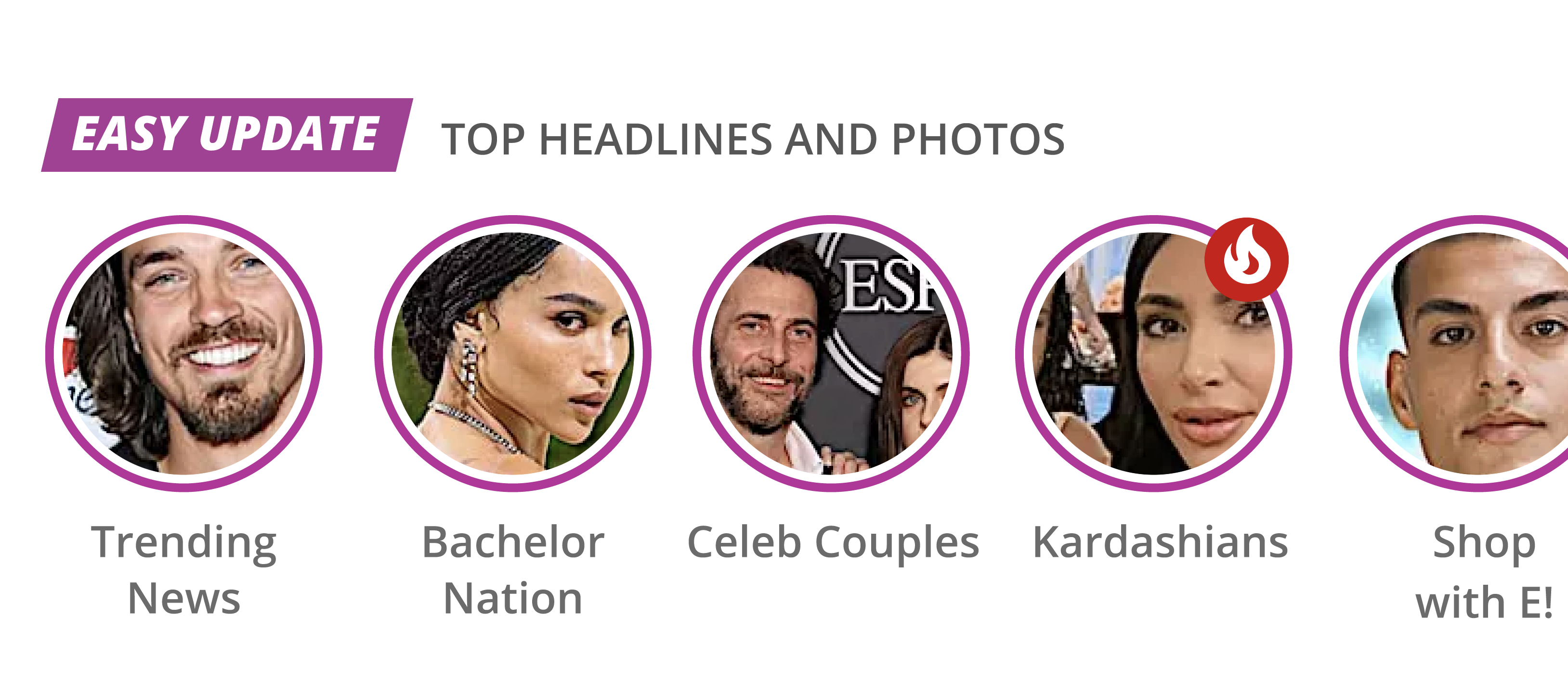
Stories Title V. 2
Using Social Proof
More modifications to be tested were around the topic of adding social proof. The first option was to add “like” and “dislike” buttons to the stories entry-point categories, in the hopes of increasing both interest and user engagement. The second option was to based categories solely on their social reactions. This option also set out to solve a problem with the images being too small and at time unrecognizable to users, as found in user research as well.
Stories experience
After coming up with research-based hypotheses for the feature’s entry point, I started researching the stories experience itself. Usability tests and attitudinal research brought up a few pain points users were having with the existing experience. Two pain points that required special design work were:
- Unclear navigation - the navigation between stories and their categories, was found to be unclear to users. Though based on seemingly familiar gestures, inspired by similar features in social media, users repeatedly failed the tasks to move to the next story, switch category and pause.
- High drop rates - though not a user pain point, this was a main problem of the feature maintaining user engagement. As users would swipe up on a story, they would be navigated to read the full article on a page where the stories’ entry point did not exist. In order to allow users to continuously return to the stories feature, validating its value, a suggestion was made to load a Taboola generated article page for stories. This page would have the article, Taboola ads, and the option to return to the stories UI. A programming issue arose from this solution which was loading time, as the system would have to generate this page on the spot.
Solutions
- An integrated walkthrough process - the user’s first experience with the stories experience included guides that would “gently” help the user understand their options while browsing the different stories. Usability tests showed a distinct increase in users being able to perform navigation tasks when first being introduced to the walkthrough version.
- A skeleton loader for a story article - In order to solve the latency issue with a Taboola powered page to navigate to from the stories experience, I create a skeleton loader, and a page which clearly navigates back to the stories experience, keeping the user oriented within the stories’ context.
A Stories walkthrough for first time-users
A Story article page with skeleton loader
3. Taboola Vignette
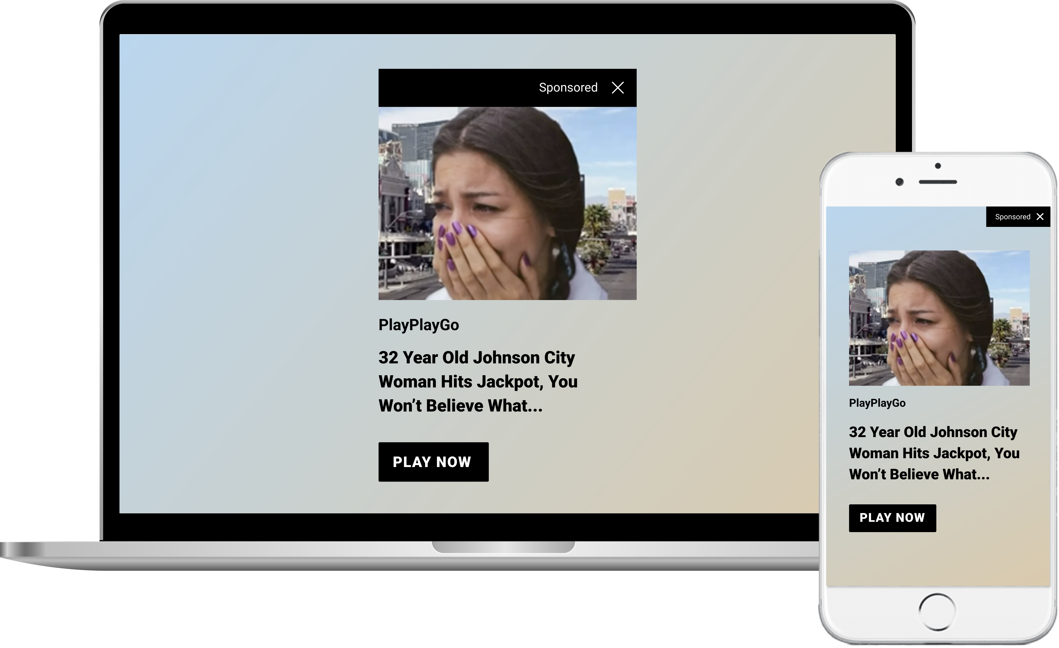
The Challenge
Taboola Vignette are full screen ads presented before page load. As part of my role I was asked to research users’ behavior with the ads’ “close” button, in order to determine the best design for this function and avoid un-intentional clicks. I was also asked to research users’ opinions about this type of ads in order to come up with optimization ideas.
User Research
I started with Usertesting.com to get users opinion about the ad. These test already brought up an issue with the ads X button which was placed at the edge of the screen, making it hard to find. Other issues included an pain point with the ad’s blurred background, and users not understanding what the ads are about. I then created several versions of the ad to test with Usability Hub. Results from the test included:
- Users were more likely to click on a dedicated close button or X button than clicking on the background to close the ad (this affirmed the attitudinal test where users were concerned that clicking on the background would open the ad page)
- Users who managed to close the ad faster were less disturbed by it (measured by no. of users requesting the ad should be removed all together)
- Users were more inclined to click the when the ad was designed to use the company logo (instead of just its name), and the brand’s color palette for the CTA button and title text
Solutions
- The first solution, which proved successful in reducing unintentional clicks was to have the X button more adjacent to the ad itself
- The second solution, meant to increase engagement with the ad, included better hierarchy of information using font-size and weight, and replacing the blurred background with a gradient background that is derived from the image’s colors. In this solution, each ad would have its background color-picked from the image, which would result in a more cohesive design, and create dynamic backgrounds for ads to make them pop when they appear several times on the same website.
4. Share feature
The Challenge
I was asked to design a share component that our clients would be able to implement with minimum customization to fit into their websites. Another requirement was to have it take as little real-estate as possible.
Design
I designed the share component as a single FAB, from which the main sharing options would open, including a general sharing option. I chose not to use the different apps' colors in the design, but rather to use a basic, 2-color UI, utilizing the brand's color as background, and a contrasting color for the apps' icons. This allowed the feature to be seamlessly added to any publisher website, with minimal customization.


